
Scotiabank CONTACT Photography Festival
– Visual Campaign Redesign
Overview:
A conceptual rebranding for the Scotiabank CONTACT Photography Festival that challenges the conventional structure of photography-related visuals. The design aims to immediately capture attention and convey the emotional and sensory experience of photography through abstract forms and dynamic composition.
Objective & Background:
This personal project was initiated to explore how a photography festival’s visual identity could be expressed in a more unconventional and emotionally resonant way. While many photography-related festiva; rely on literal imagery or straightforward typographic layouts, this redesign focuses on breaking visual expectations. The goal was to create a new brand of that evokes the act of taking a photo — the anticipation, precision, and spontaneity — rather than merely showcasing a photo.
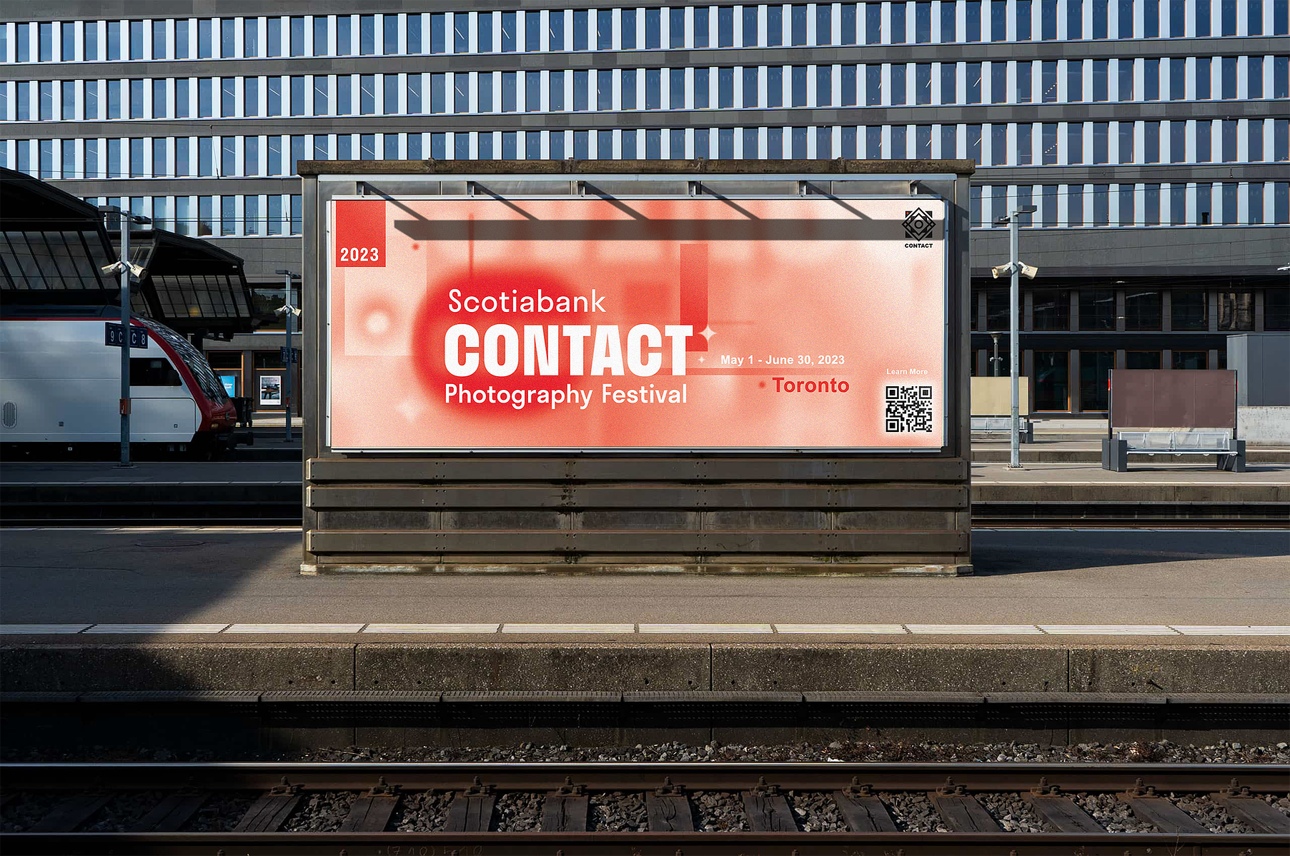
Challenges in Billboard Design:
Designing for billboard scale presented a unique set of challenges, especially in terms of legibility, hierarchy, and user context. Unlike a standard poster that might be viewed up-close in a gallery or on a wall, billboards must communicate instantly — often to viewers who are either walking at a distance or passing by quickly in cars or public transit.
This required rethinking the typographic scale and information hierarchy:
- Key messages and focal visuals needed to be dramatically enlarged and simplified for long-distance readability.
- Secondary information was either minimized or removed to avoid overwhelming the viewer.
- The design had to account for environmental distractions and viewing angles, ensuring that even from a moving vehicle or across a busy street, the billboard remained bold, clear, and communicative.
Adapting the original layout to large-scale formats meant emphasizing contrast, clarity, and immediacy — while still maintaining the conceptual and abstract visual identity developed in the core poster design.
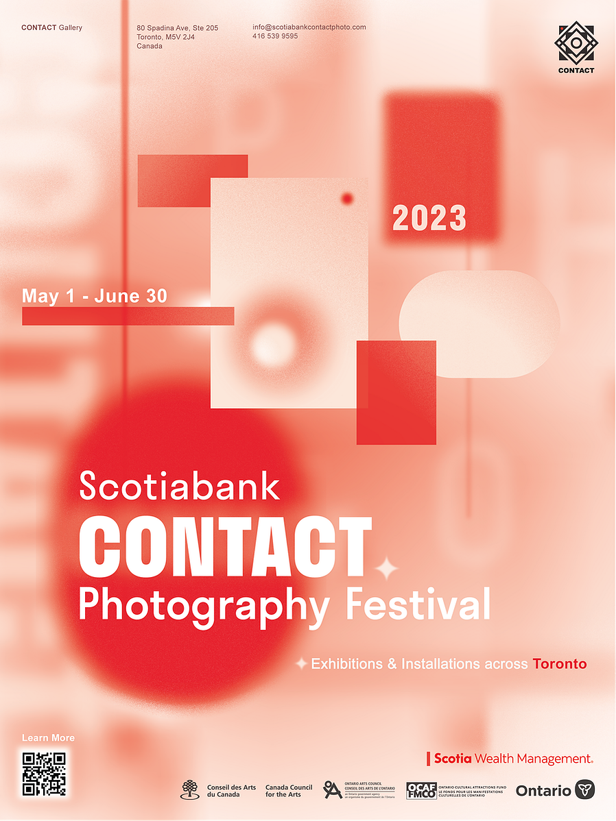
Poster
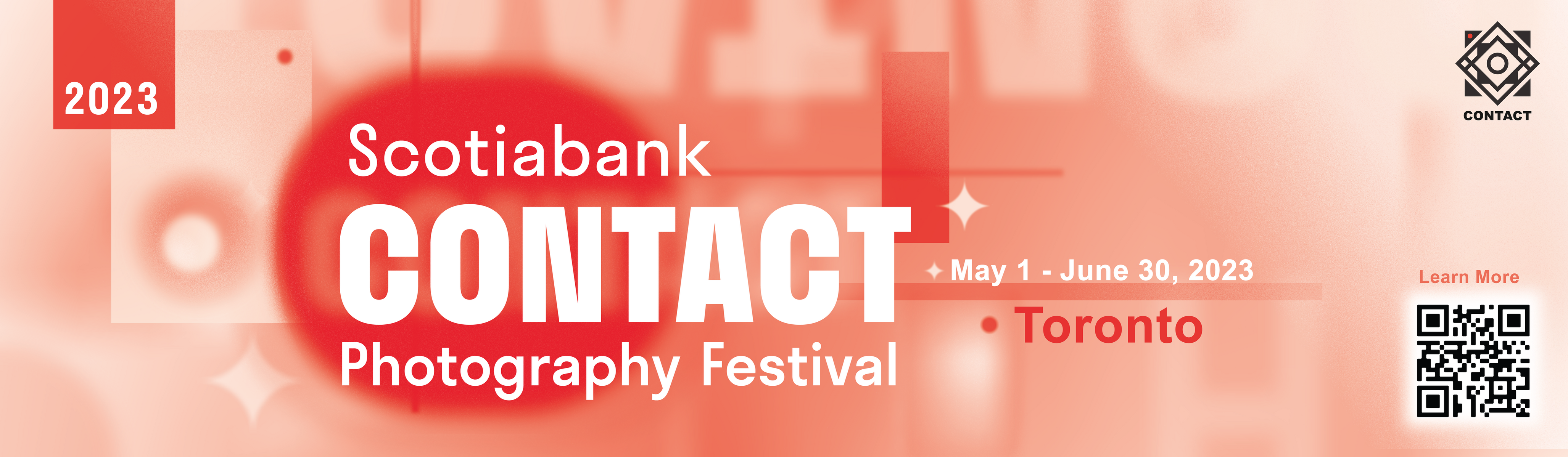
Large Format Application
Format Variations

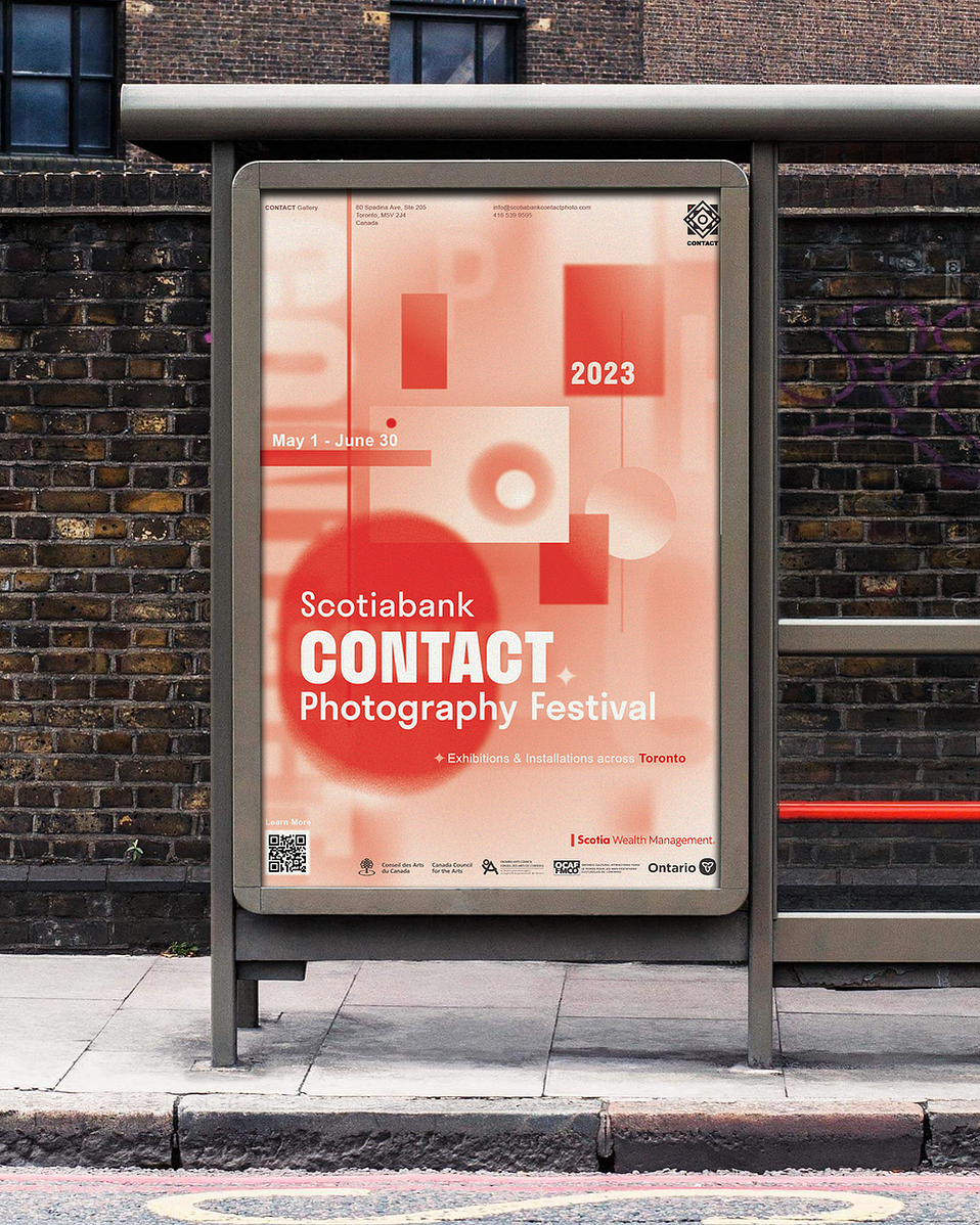
Poster
Design Description:
I begin redesign brand by creating the poster.
Rather than relying on photographic content, the poster centers around an abstract interpretation of the camera’s form and function. The core visual motif is a simplified shape inspired by a camera body, aperture blades, and lens focus. The layout uses Scotiabank CONTACT’s brand colors as a base, while incorporating visual elements that hint at depth of field, aperture adjustment, flashing, and soft focus, abstractly visualizing the act of capturing a moment.
The composition plays with tension and release — representing both the mechanical precision of the camera and the emotional spontaneity of photography. By abstracting these familiar elements, the design not only draws attention but invites viewers to think more deeply about what it means to observe, frame, and record the world through a lens.
Client:
Self-initiated concept project
(Inspired by the Scotiabank CONTACT Photography Festival)
Target Audience:
Researching the festival’s actual demographics and positioning, the primary audience includes:
- Professional and emerging photographers interested in showcasing or attending exhibitions
- Creative industry professionals (designers, curators, art directors)
- Photography students and enthusiasts seeking inspiration or education
- General public and art lovers in Toronto or surrounding cities with an interest in contemporary visual culture
- Festival-goers looking to experience diverse photographic expressions in public and gallery spaces
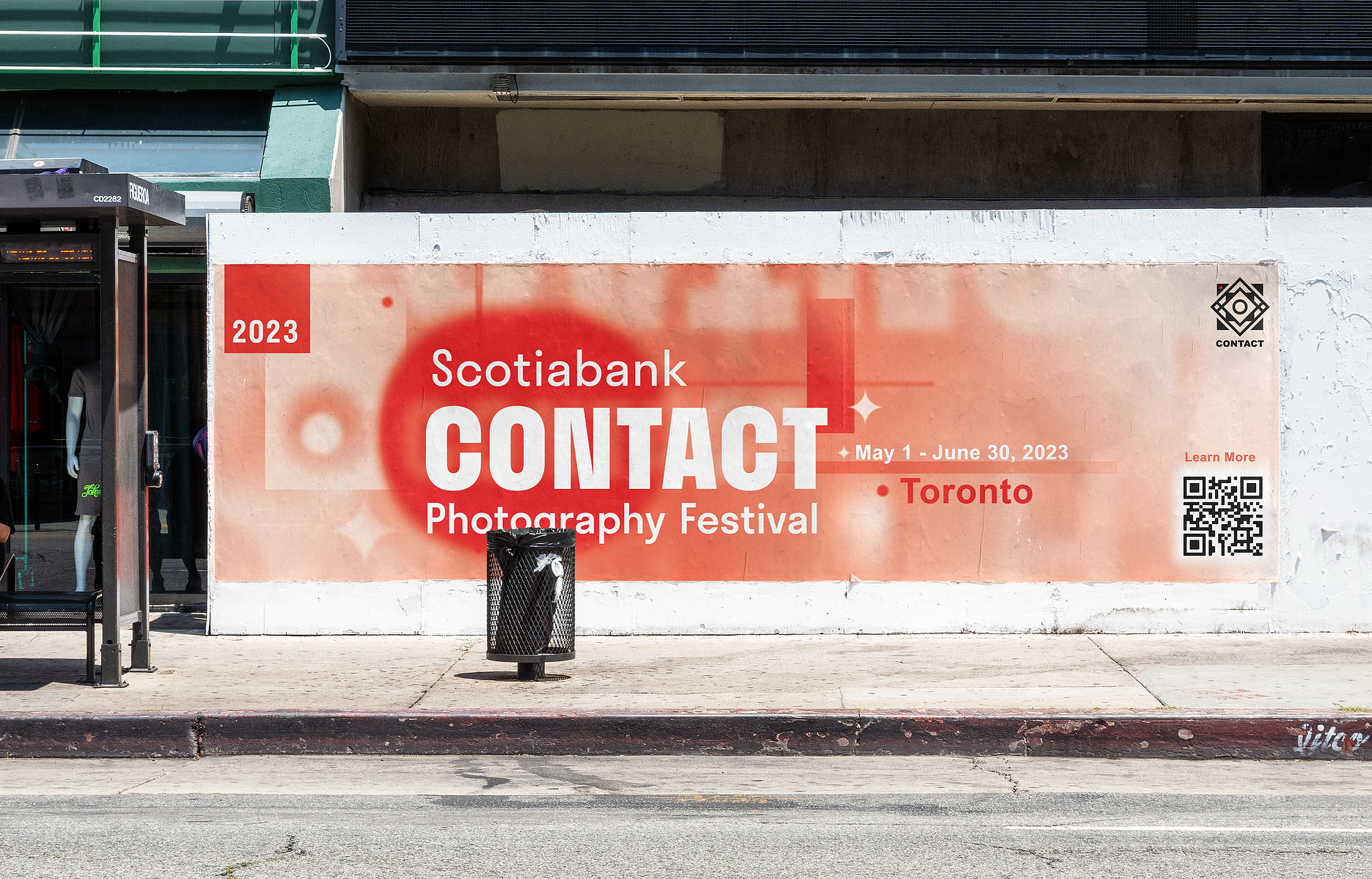
Wall Wrap
Subway Billboard